10 Examples of Brilliant Email Marketing (and Why They're So Great)
by Ginny Soskey

October 31, 2013 at 11:00 AM
53
inShare
inShare
 At one point or another, we all need inspiration to do our jobs better. It doesn't matter whether you're a marketing veteran who has navigated through years of changing technology or a newbie fresh out of college -- we all need to see examples of outstanding content. It helps us get through creative ruts, make the case to our boss for experimentation, and make our own marketing even better.
Most of the time, inspiration is easy to find because most marketing content is publicly available. You can scour the internet or go on your favorite social network to see what your connections are talking about.
But there's one marketing channel that is really, really hard to find good examples of unless you're already in the know: email. There's nothing casual about it -- you either need to be subscribed to an email list or stumble on a roundup kinda like this one to find great examples of emails. And even if you're subscribed to good emails, you're often getting bombarded day after day by them, so it's hard to notice the gems.
Because of the difficulty to find good examples on email, we decided to do the scouring for you. What we found were 10 examples of effective email marketing. Read on to find out which emails we chose and get the lowdown on what makes them great -- or just keep on scrolling to get a general feel for each. However you like to be inspired is fine by us!
And if you want to learn what you need to create a five-star email, we've developed a handy guide to help you out!
1) BuzzFeed
I already have a soft, soft spot for BuzzFeed content (70 pictures of dogs in their Halloween costumes, anyone?), but that isn't the only reason I fell in love with its emails.
First of all, BuzzFeed has awesomely written subject lines and preview text. They are always short and punchy -- which fits in perfectly with the rest of BuzzFeed's content. I especially love how the preview text will accompany the subject line.
For example, if the subject line is a question, the preview text is the answer. Or if the subject line is a command (like the one below), the preview text seems like the next logical thought right after it:

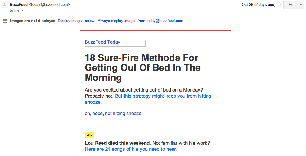
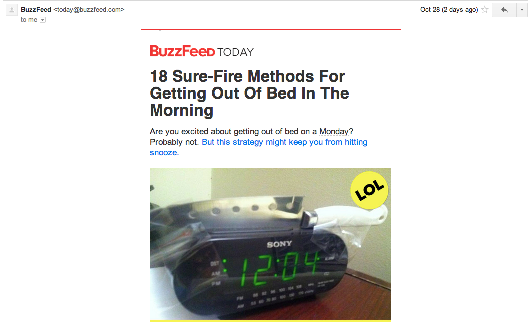
Once you open up the email, the copy continues to be great ... but that's all been out-shadowed by something else. Just take a look at that glorious alt text action happening where the BuzzFeed logo and first image should be. The email still conveys what it is supposed to convey -- and looks great -- whether you use an image or not, and that's definitely something to admire.
Without images:
With images:
2) Brain Pickings
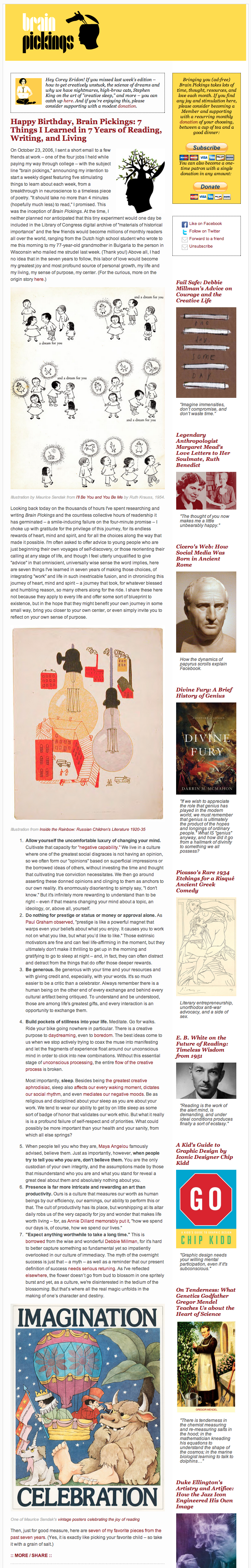
On first glance, you probably wouldn't choose this email as the best email you've seen in a while. If you're not an avid Brain Pickings reader, I'd guess you'd be incredibly overwhelmed when opening it -- I know I was.
But the reason I included this email here is because it's brilliant for its reader persona. People who read Brain Pickings are intellectual, avid readers. Chances are, they love classic literature or highbrow pop culture -- and maybe a bit of both. An email that takes you a full minute to scroll through and is also chock-full of interesting information is the perfect email for them.
So if you're trying to improve your email open and clickthrough rates, try experimenting with different content lengths. Who knows? Your leads and customers may like something completely different than you imagined.
3) RunKeeper
Lots of people hate on email newsletters. There's too much going on! There's no focus! They're the worst emails ever! I'm not going to argue that there aren't bad email newsletters out there -- because there certainly are -- but more people are doing them right than most assume.
Take a look at RunKeeper's email newsletter below, for example. Off the bat, it's just beautiful. The images used all evoke various emotions -- laughter, intrigue, happiness, or just plain admiration -- so you naturally want to click.
Honestly, I don't even focus on the copy in this email because the images are so awesome. The newsletter layout is also visually pleasing -- more prominent stories get more prominent space -- so you know what you should be clicking on. All in all, the email is just gorgeous.
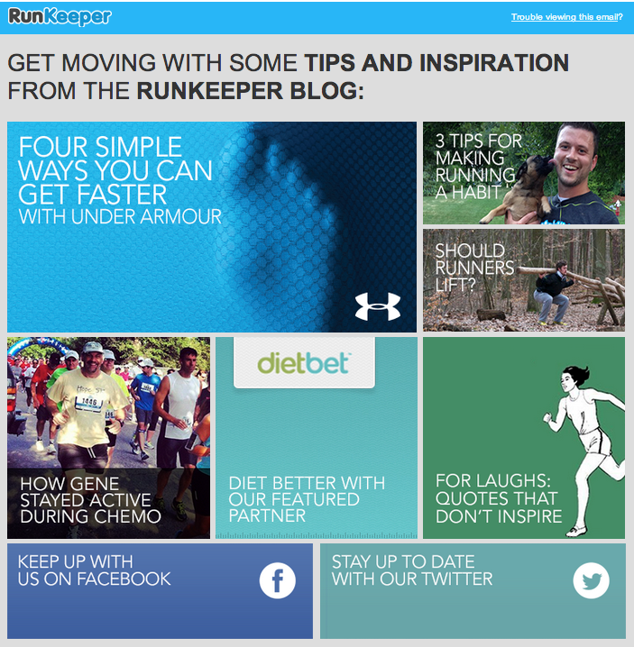
Bonus: It's gorgeous on mobile too. The design is completely responsive and easy to use on my phone. I'm not scrolling for ages, and my fat fingers can actually click on the right things.

4) 1-800 CONTACTS
When people talk about email marketing, lots of them forget to mention transactional emails. These are the automated emails you get in your inbox after taking an action on something on a website. This could be anything from filling out a form to purchasing a product. Often, these are plain text emails are those that you set and forget.
Well, 1-800 CONTACTS took an alternate route. Its ordering process is long -- you have to order contacts, get your specific lens prescriptions filled, then get it shipped. So, to keep customers in the loop, 1-800 CONTACTS sends automated emails with a progress bar to tell you where in the ordering process you are.
With the progress bar, you don't even need to read the email -- you know immediately where you are in the whole process so you can move on to better things.

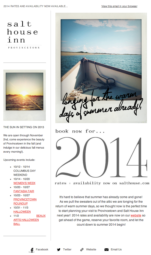
5) Salt House Inn
Like RunKeeper, Salt House Inn's emails have gorgeous imagery -- and on closer inspection, you can see that they didn't spend a dime on them. Oh, I'm not talking about the image quality -- that is way above par. But do you recognize the telltale square shape? Pretty filters? Yup, those images are from Instagram, and they're gorgeous.
The lesson here: Make use of whatever visual assets you have to make your emails look gorgeous. Whether you are using free stock photos, icons, or just images from your own Instagram account, you have the opportunity to make your subscribers notice and clickthrough on gorgeous graphics.
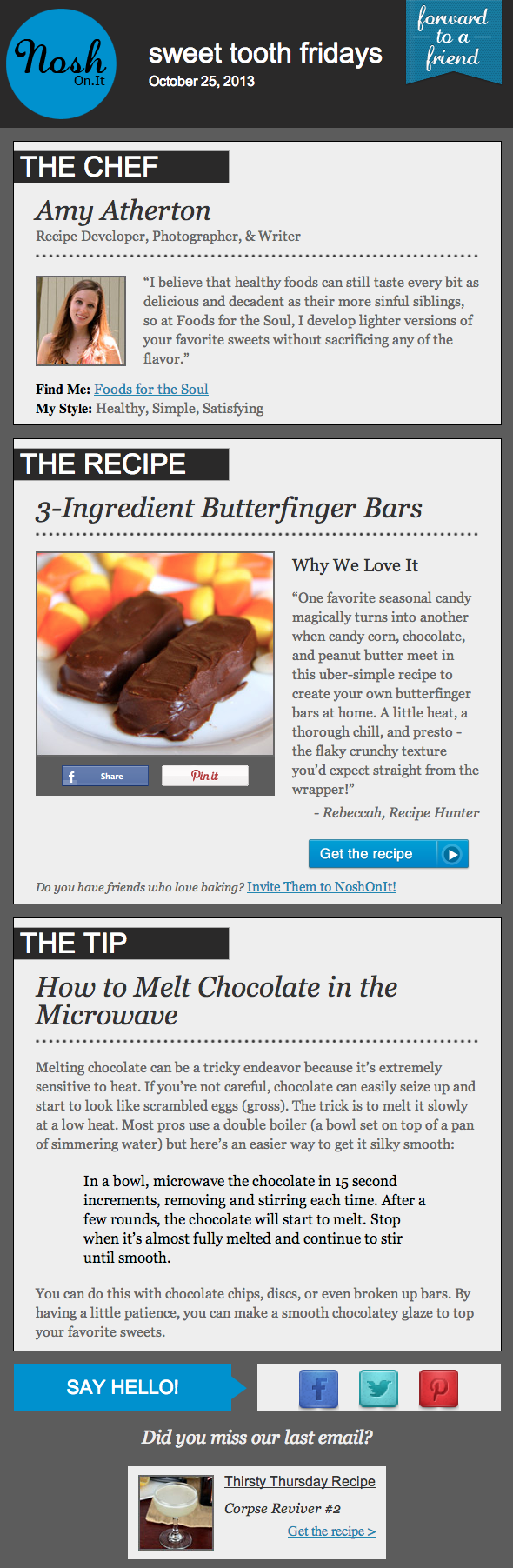
6) Nosh.On.It
I've been a huge fan of Nosh.On.It for a while -- the company sends yummy yummy recipes to my inbox every day. But I didn't just include it because of its delicious recipes ... I'm truly a fan of its emails. I love its layout: it features three distinct sections (one for the chef, one for the recipe, and one for the tip) in every single email it sends. This means you don't have to go hunting to find the most interesting part of its blog posts -- you know exactly where to look after an email or two.
I also love Nosh.On.It's "Forward to a Friend" call-to-action in the top-right of the email. Emails are super shareable on -- you guessed it -- email, so you should also think about reminding your subscribers to forward your emails to friends, coworkers, or heck, even family!
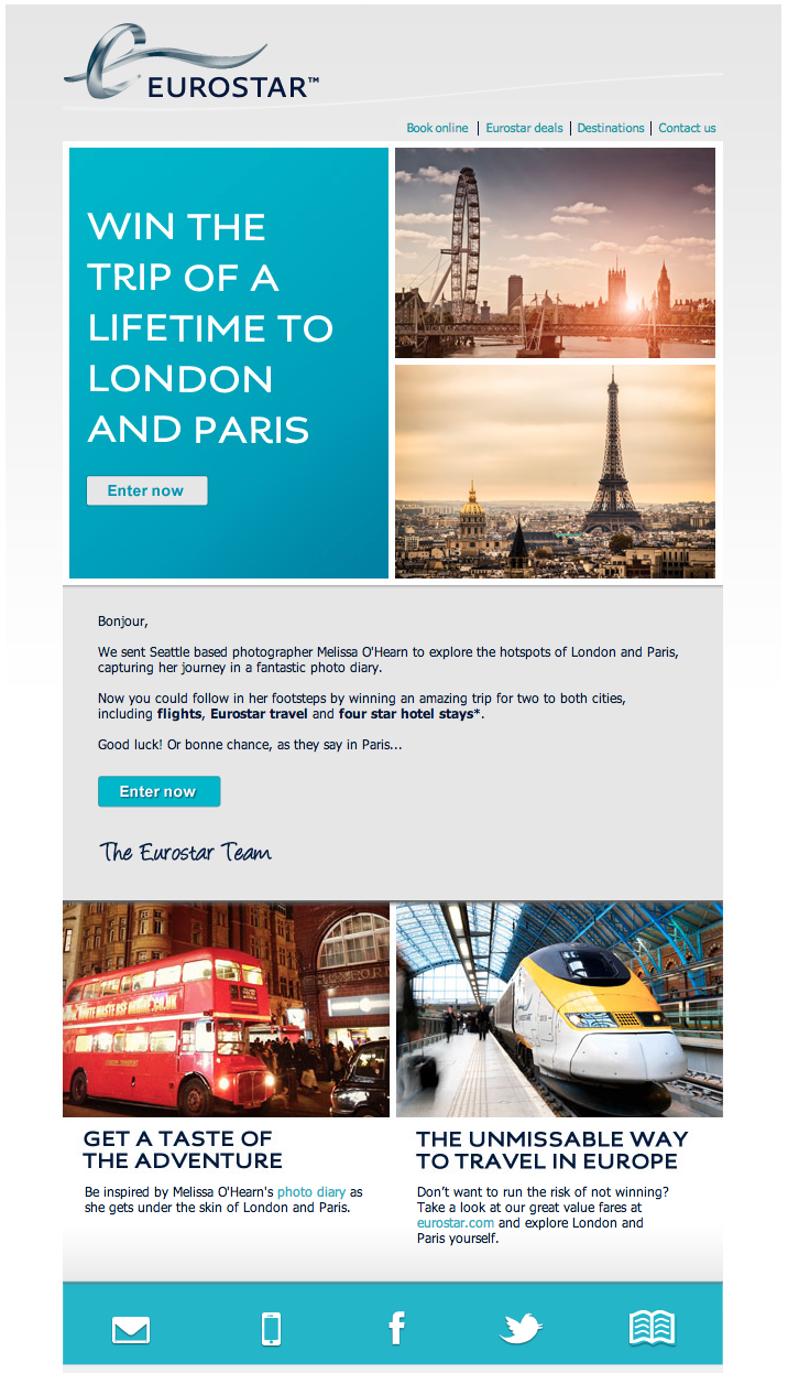
7) Eurostar
After I got this email, I knew exactly what I wanted to do: win a trip of a lifetime to London and Paris. Why? You can probably guess: Besides the gorgeous pictures of two beautiful cities, Eurostar also has some pretty in-your-face CTAs in this email. I love how a CTA is featured above and below the fold to take the same action -- it appeals to both the impatient and the scrupulous.
The writer in me also loves how Eurostar opens its email. "Bonjour," it says, immediately making you think of walking the streets of Paris, maybe popping into a creperie. That simple language choice spoke more about the marketing offer than the entire email did.
8) AT&T
I normally hate on AT&T (and pretty much all phone companies), but I thought this example fromMarketing Land was a brilliant use of responsive design. Yes, the imagery looks great on both devices -- the colors are bright, and it's not too hard to scroll and click -- but the mobile email actually has features that make sense for you to do if you're on mobile.
Notice the "call now" button -- on the left (the desktop), it's a written out number. On the right? A simple CTA that lets you call someone now because you're already on your phone. It's also given more prominent placement than "shop now" because people call on phones much more often than shop. Smart, smart marketers.

9) Brit + Co
An essential element of an email subject line is to set expectations of the email inside. For example, if you're going to offer a coupon, you want to let your subscribers know that the email contains it right in the subject line. Seems simple, right? It's not always.
Setting expectations -- and then delivering on them within the email -- can be difficult. Thus, why I love this email from Brit + Co. Here's the subject line:

And then here's the email:
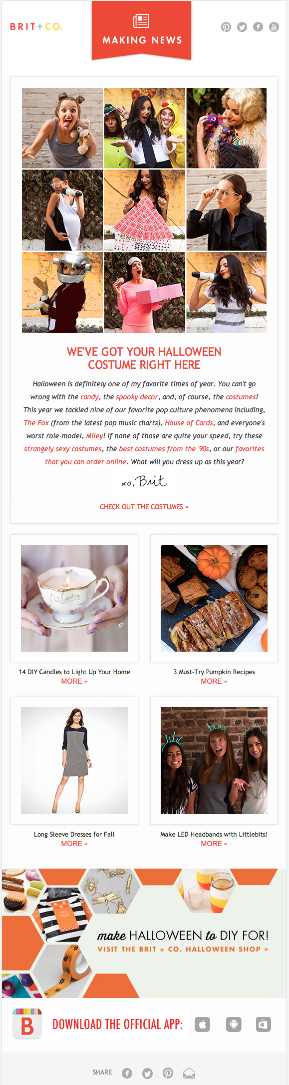
When Brit + Co said "Look No Further" in the subject line, the company wasn't kidding. Right away, you see nine costume ideas -- of course, in gorgeous photos. Even though you have to click through to see all of the costumes, you believe the promise that you won't have to do more research for costume ideas -- and then, feel okay clicking on the email.
I'd take a guess that Brit + Co's CTR on this email was huge. Delivering on expectations set in the subject line is definitely a best practice we all should follow.
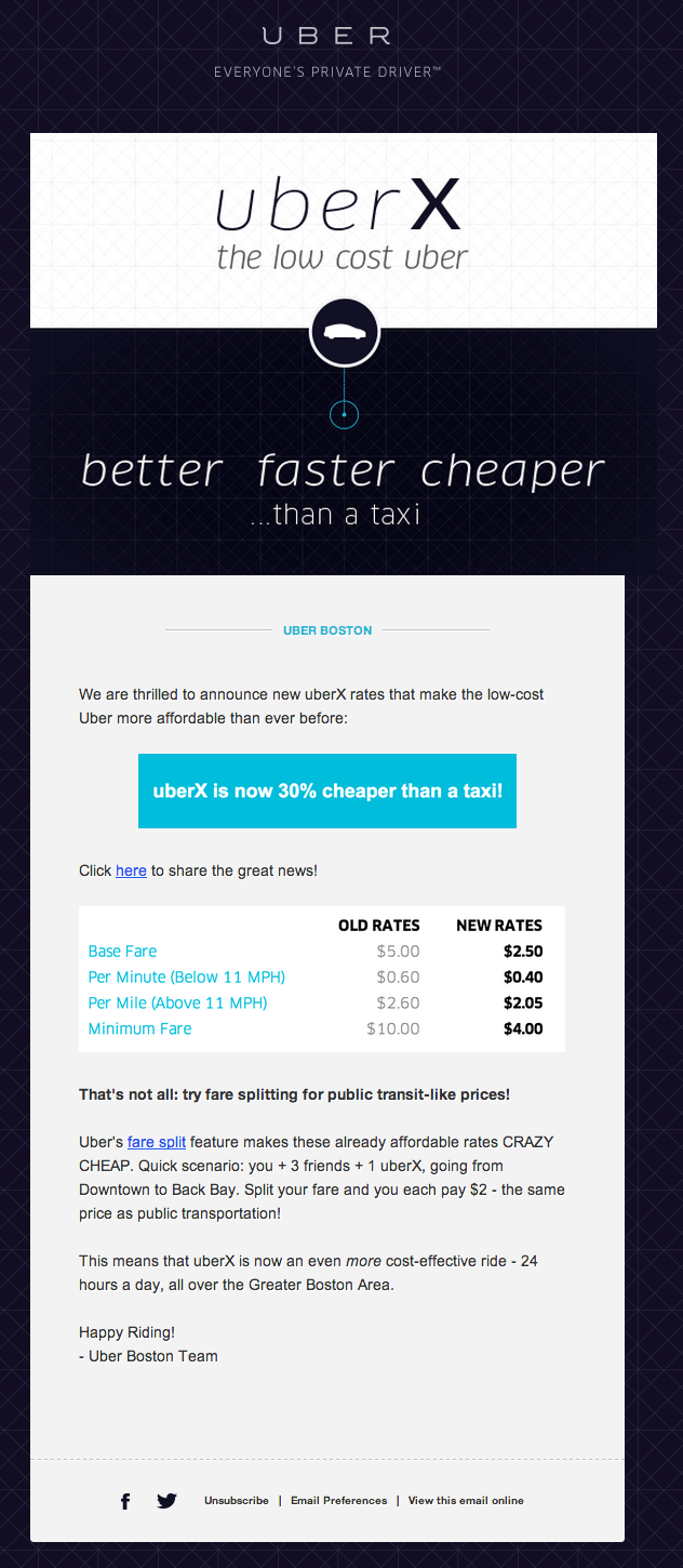
10) Uber
Last, but certainly not least, we have Uber's email. Design-wise, this email takes the cake. It's super easy to scan, making it easy for you to digest what it's about without reading any of the copy at all.
Give it a quick once-over -- what do you notice? The "better faster cheaper than a taxi" slogan that appears above the fold, the neon blue box that says Uber X is 30% cheaper than a taxi, and then the new rate ... which is exactly what Uber wants you to know.
Because this email is about driving awareness of a new product rather than converting someone to become a lead or customer, that's all you really should be noticing. So hats off to Uber forusing design to better communicate its message!
These are just some of our favorite emails. Who sends you emails that you love? Share your favorites in the comments, and we'll check them out for future posts like these.


